With the help of both http://www.pdfmerge.com and http://combinepdf.com, I was finally able to tackle my viewing problems. By margining my pdf into sections using pdfmerge and then combining them altogether using combine pdf, I was finally able to upload my portfolio to Issuu.
https://issuu.com/shannonmcnamara/docs/combinepdf-4
Sunday, 26 February 2017
Issuu Problems
Over the past week, I have been trying to upload my portfolio to Issuu. Unfortunately this has been an overall failure with every method I try.


Monday, 30 January 2017
Portfolio Design
After completion of my CV, I have began to plan out my portfolio. Before I began to add content I decided on my colour scheme and font. I have decided to keep the theme of my CV and incorporate it into my portfolio.
The colour scheme I have chosen is:

I will primarily use the two pink colours for my portfolio.
The next decision I made is the font for my portfolio. Again, I have to decided to keep my cv design consistent with my portfolio and have decided to use the font Delihi previously used within my Curriculum Vitae. I have downloaded this font from dafont.com and have installed into both Adobe Illustrator and Adobe Photoshop.

My next step was to decide on what content I will include in my portfolio. I will include a table of contents, my cv and my projects. I have decided to include projects I have completed last semester and projects I have completed from my previous course over the last four years.
Upon research of various portfolios, many people add a mood-board to describe themselves within their portfolio. Im still making a decision to add a mood-board to my portfolio to add a sense of personalisation and portray my personality to potential employers.
As I have decided on my overall colour scheme, font, and potential content I will begin to design my portfolio using the Adobe suite.
The colour scheme I have chosen is:
I will primarily use the two pink colours for my portfolio.
The next decision I made is the font for my portfolio. Again, I have to decided to keep my cv design consistent with my portfolio and have decided to use the font Delihi previously used within my Curriculum Vitae. I have downloaded this font from dafont.com and have installed into both Adobe Illustrator and Adobe Photoshop.

My next step was to decide on what content I will include in my portfolio. I will include a table of contents, my cv and my projects. I have decided to include projects I have completed last semester and projects I have completed from my previous course over the last four years.
Upon research of various portfolios, many people add a mood-board to describe themselves within their portfolio. Im still making a decision to add a mood-board to my portfolio to add a sense of personalisation and portray my personality to potential employers.
As I have decided on my overall colour scheme, font, and potential content I will begin to design my portfolio using the Adobe suite.
Monday, 23 January 2017
Assignment 1- CV Design Complete

Upon completion of my CV my next step is to develop my portfolio using both Adobe Illustrator and Adobe Photoshop
Saturday, 21 January 2017
Assignment 1: The next step!- Development of my CV
After careful research of various portfolios and CV's, my step was to develop my own excellent designed CV. To do this, I used various examples I have researched to customise to my own preference.
Before I began, I decided on a colour scheme that I plan to use in relation to my cv and portfolio. I then decided on what fonts I would like to use and finally I decided on my skills and information I need to display on my CV.
Colours
The colour scheme I have chosen is a palette that contains, pinks, blue's, yellows and browns. I found this palette from colourlovers.com

Why Pink?
Overall, I plan to use the two shades of pink primarily for my cv and incorporate the various other colours into my portfolio. Pink is a combination of the colours red and white. Pink contains the need for action of red, helping to achieve potential success. With this CV I hope to successfully secure a job within the sector of Information Technology.
Fonts
The next decision was the fonts I would use on my CV. I decided on two fonts. These fonts are Delhi regular and Segoe UI Light.


Contents of CV
Finally, I decided on what information I thought was extremely important to include on a cv for potential employers. This information included:- A basic summary about myself
- This summary will describe my latest education, past education and skills I have developed in the last few years
- General information
- General information will contain information on my location and age
- Education information
- Education information will contain information on my latest and previous course that I have completed. I also decided to include my awards of my degrees.
- Work Experience information
- My work experience includes information on my previous experience, location of this experience and the dates of these jobs
- My Interest
- To make my CV more personal, I decided to included a few of my interests. I will display these interests using infographics
- My Skills
- I will list my technical skills on my cv. This skills will also be displayed using infographics
- My Contact details
- My contact details will include my mobile number, my email address, my Behance link and my LinkedIn link.
To ensure my CV is eye-catching I have decided to use various info-graphics to make my cv look more quirky and professional. The software I plan to use is Adobe Photoshop. Once my cv is complete I will upload it to Behance and begin to develop my portfolio.
Assignment 1: CV Design
The next step within the assignment was to research five excellently design CV's online. Once I research five excellent CV design I must update my own CV to ensure that all my education and work experience is up to date.
An excellent designed CV should include:
Using a mixture of various websites including Behance and Pinterest I began my research. It was easy to find 5 excellently designed CV but it was extremely hard to pick just 5. The following are the CV I picked.
1. SMOG Creative CV, Miguel Rato, 2012
Reference: https://www.behance.net/gallery/3149770/SMOG-Creative-CV

2. Info-graphic CV, Ana Lourenco, 2012
Reference: https://www.behance.net/gallery/5429809/Infographic-CV


Why is this CV design excellent?

Why is this CV design excellent?

Why is this CV design excellent?
An excellent designed CV should include:
- Personal contact details
- Phone number, email address, social media platforms including LinkedIn
- Show off who you are and your personality
- Do not include hard to read typography
Using a mixture of various websites including Behance and Pinterest I began my research. It was easy to find 5 excellently designed CV but it was extremely hard to pick just 5. The following are the CV I picked.
1. SMOG Creative CV, Miguel Rato, 2012
Reference: https://www.behance.net/gallery/3149770/SMOG-Creative-CV

Why is this CV design excellent?
- Order of contents
- Use of graphics
- Personal touches to the cv-image, short paragraph to describe the creator
2. Info-graphic CV, Ana Lourenco, 2012
Reference: https://www.behance.net/gallery/5429809/Infographic-CV


Why is this CV design excellent?
- Order of contents
- Use of graphics
- Personal touches-image
- Display of skills
- Consistent design throughout
3. Info-graphic CV, Chen Zhi Liang, 2013

Why is this CV design excellent?
- Order of contents
- Use of infographics
- Eye-catching design
4. Info-graphic Resume, Morgan Kourim, 2014

Why is this CV design excellent?
- Order of contents
- Use of graphics
- Use of colour
- Display of skills
- Personal logo used
5. Curriculum Vitae, Ryan Eccleston, 2012
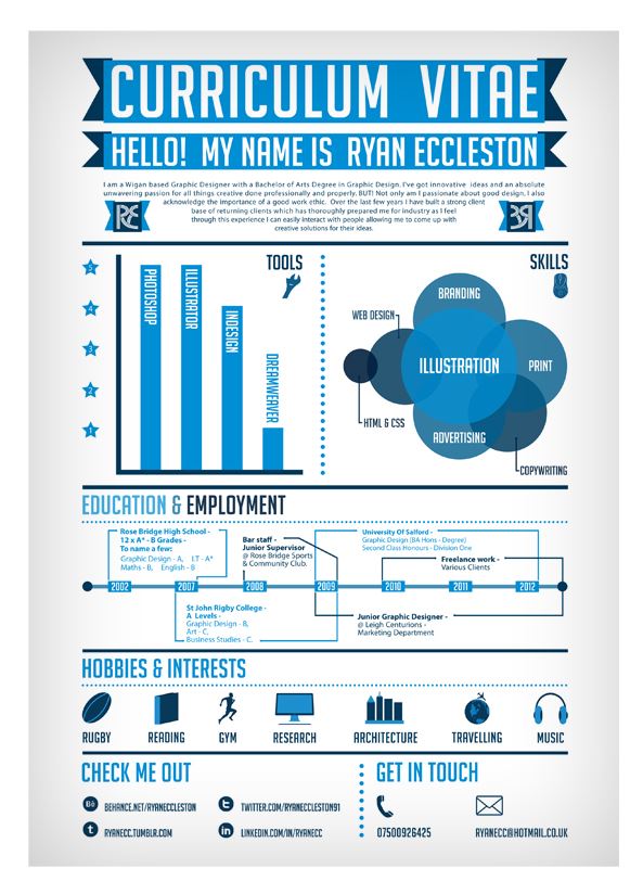
Why is this CV design excellent?
- Order of contents
- Use of graphics
- Consistency
Tuesday, 17 January 2017
Assignment 1: Creating your personal brand research
The main objective of this assignment is to begin to create a professional brand. This professional brand will be used to seek employment for our work placement online. As a multimedia designer it is my job to create a portfolio and build confidence for my work online.
The first thing I must do is research. For the research aspect of this assignment I will begin by signing up to two main websites that will enable me to complete my work. These websites are issuu.com and behance.net. I will use these websites to search for excellent examples of publication based on self promotion. Before I do this I must sign up to these websites.
Previously, I completed registration for these websites I began to search about self promotion. Self promotion 'is the act of promoting or publishing oneself or ones activities'. Once I was familiar with the term I began my research of self promotion on Issuu.
Issuu
Issuu is a free electronic publishing platform for magazines, catalogs and newspapers. I looked at various self promotion booklets, cv's and portfolios and chose a numerous amount that I thought were excellent examples of publications. The following are the examples that I have chosen:
1. Exhale Hues, Matthew Ockelford, 2011

What caught my eye with this self-promotion portfolio was the simplicity of the front cover with very little colour included and just provides brief details of the author and their work. As you begin to move through the pages you can see that the publisher provides various information about their self. They also include a graphical design image to portray their self. I quite liked this, as for a previous module we developed our own personal branded logo and thought it would be a great idea to include this as it would provide potential employees with a clearly representation of you as a person.

Again, as you move through the booklet you can see the publishers work and images. I believe when creating a personal brand images will play a major role as they will allow potential employers to capture an idea of the work that you have previous completed.
Why did I choose this?
I chose this self promotional booklet as the developer incorporates his own personal logo within his booklet. As I have developed my own logo I thought it was an excellent idea to incorporate it somehow into my portfolio.
Why did I choose this?
I chose this self promotional booklet as the developer incorporates his own personal logo within his booklet. As I have developed my own logo I thought it was an excellent idea to incorporate it somehow into my portfolio.
2. CV Portfolio, Carlotta Fumagalli, 2013
Reference: https://issuu.com/carlotta-fumagalli/docs/cv-portfolio
Reference: https://issuu.com/carlotta-fumagalli/docs/cv-portfolio
Like the above portfolio, this self promotion booklet caught my eye for its simplistic front cover. It provides the publishers name and her personal branded logo.

As you move through the booklet, the publisher provides their curriculum vitae. Curriculum vitae's are extremely important as it is your first chance to make a good impression with potential employers. The author provides basic contact information, education and employment history.
The next thing I really liked about this particular promotional booklet was a timeline of the publishers work, employment history was included. I thought this was extremely interesting and a nice aspect to include. She also includes various pages of the work she has part-taken in. The work the author has part-taken in is extremely important to include within a self promotion booklet.
The next thing I really liked about this particular promotional booklet was a timeline of the publishers work, employment history was included. I thought this was extremely interesting and a nice aspect to include. She also includes various pages of the work she has part-taken in. The work the author has part-taken in is extremely important to include within a self promotion booklet.


Why did I choose this?
I chose this portfolio because of uniqueness in comparison to various self promotion booklets I have researched. I really enjoyed the timeline of events that the publisher included about her education, work experience and projects that she had taken part in. I found it a very unique and quirky way to display her work.
3. Self Promotion Portfolio, Sophia Wareham, 2014
Reference: https://issuu.com/sw.designs/docs/sophia_wareham_self_promotion_portf
Reference: https://issuu.com/sw.designs/docs/sophia_wareham_self_promotion_portf
While researching self promotion within Issuu, I found this self-promotion to be one of my favourites. The front cover is kept simplistic and includes the publishers signature.


While analysing the portfolio, the publisher uses her signature as her own personal branded logo. Sophia includes information on how she designed her decided on her personal logo and also included illustrations of other ideas she had when designing. I believe this page of the booklet is extremely important as it allows viewers or potential employers to see how creative you can be.

Sophia also includes a mood-board. A mood-board is 'an arrangement of images, materials, pieces of text intended to evoke or project a particular style or concept'. In Sophia's case, she uses the mood-board for the intended audience to get a sense of her personality and who she is.

I really liked Sophia's self-promotion booklet as it gives a sense of who she is and she has allowed her personality to be incorporated within it while still promoting herself to potential employers.
Why did I choose this?
I chose this portfolio because of its personalisation using the mood board. The mood board allowed Sophia to showcase her personality while also showcasing her work to potential employers. The overall layout was excellent and is clear and consistent throughout.
4. Self Promotion Portfolio, Sophia Wareham, 2013
Reference: https://issuu.com/sw.designs/docs/self_promotion
This portfolio has the same publisher as number 3. Again I really enjoyed Sophia's work. Her front cover was based on using an envelope to provide a letter type effect to her portfolio but included a sticker on the envelope with her initials. Her initials represent her self branded logo here.

Again inside she includes a table of contents, a mood-board and various projects in which she has taken part in.


Her back-cover includes her branded logo, contact details, education and qualification, work experience and employment details.
Why did I choose this?
I chose this portfolio as I really enjoyed the overall design and self branding that was included within the publishers work. Her overall design and layout was clear and consistent throughout.
If I was to based my portfolio from Sophia's work instead of using an envelope I would use a closed laptop to represent my technical skills and each page afterwards would be a laptop screen filled with information.
5. Portfolio- Creative Multimedia Programming, Roisin McArdle, 2013
Reference: https://issuu.com/roisin_mc_ardle/docs/portfolio
While researching various self-promotion booklets, I came across a former Creative Multimedia Programming students work. Within the booklet includes a page that introduced Roisin. I really enjoyed this page with the creativity to create the milk carton and information about herself.

Why did I choose this?
I chose this blog for its creativity and style. I enjoy how Roisin used more images than wording to self promote her work. I like overall the simplicity of the project but still show cases her work professionally.
Behance
Behance is a network of sites and services specialising in self-promotion, including consulting and online portfolio sites. The following are the examples that I have chosen are what I think are excellent illustration of publication based on self-promotion:
1. Personal Resume and Promotion, Tibor Van Den Brick, 2014
Reference: https://www.behance.net/gallery/20804925/Personal-Resume-Promotion
This Personal resume and promotion caught my eye for its layout. I really like the use of graphics to make their CV more interesting. I also enjoyed the use of colour and how the overall layout is aligned. As you can see this CV contains a lot of white space which is excellent as it is easier on the eye and a good element of design.


Why did I choose this?
I chose this CV as I love how the graphics are incorporated into the Cirriculum Vitae. I really enjoyed how the CV has ratings for Design skills and Personal skills. I also chose this CV because of the timeline for both education and work and how it is presented overall.
2. My Resume- Personal Branding Design, Mateo Innominato, 2016
Reference: https://www.behance.net/gallery/32965753/My-Resum-Personal-Branding-Design
What caught my eye with this resume is the overall structure and colours. I believe the colours used within designing a resume is extremely important. The graphics Mateo use works extremely well and ensures that the resume is eye catching. It is highly important to ensure your resume is eye catching because the right resume design speaks to your individual skills and personality and can propel your application to the top of the stack.


Why did I choose this?
I chose this resume because it is eye catching. An eye catching resume is highly important to be noticed by potential employees. I really like the use of colour and graphics Mateo used to represent his personality along with his learning experience timeline and his introduction.


3. Curriculum Vitae, Vincenzo Castro, 2015
Reference: https://www.behance.net/gallery/26611697/Curriculum-Vitae
Again like Mateo's Resume, this one caught my eye because of its use of graphics and colour. Although it is not recommended to use a black background, I believe it works well with the yellow graphics and white text.


Why did I choose this?
I really enjoy this resume as I believe it is more technical Cv with the use of a graphics to explain his various achievements and education etc. He uses a mobile phone to represent his contact details, a mouse is used to describe his software skills, a book to represent his education timeline.
4. Resume / Curriculum Vitae, Genevieve Lovelock, 2012
Reference: https://www.behance.net/gallery/4394653/Resume-Curriculum-Vitae
This CV was used to represent a web designer. It uses simple graphics to highlight the persons skills, work experience and education while also providing information to sum up the individual.


I chose this CV for its simplicity yet graphical way of promoting their skills. I like how each section is separated by colour eg. Introduction is white, design and software skills grey. I also like how the personal logo is incorporated into the CV to introduce the person and their personality.
5. Self Promotion, Syril Bobadilla, 2014
Reference: https://www.behance.net/gallery/14469985/Self-Promotion
Out of the CV I have researched and viewed, this is possibly my favorite as it is eye-catching, colourful and of course, creative.


Why did I choose this?
I chose this CV for its eye-catching colours and layout. Each and every section of the CV is layout perfectly and the use of graphics to represent the developers interests rather than using words. I really like how the developer software skills are represented as if it exam results. He provides a legend on his CV to understand what each mean. I also really enjoyed how he incorporated a hire me section. The section has 3 boxes stating defiantly hire, maybe hire and no thank you. This quirky ideas are excellent as they really catch a potential employers eye and also enables you to showcase your use of graphics and creativity within your CV.
Subscribe to:
Comments (Atom)